formula <- "ggplot(iris, aes(x = ppVar, y = ppVar, color = ppVar)) + geom_point()"

ui <- ptr_ui_page(                          # Bootstrap page + single .ptr-app + assets
  ptr_ui_header("Iris explorer"),
  shiny::fluidRow(
    shiny::column(4, ptr_ui_controls(formula = formula)),
    shiny::column(8, ptr_ui_plot())         # bare plot card; error placed below
  ),
  ptr_ui_error(),                           # error banner in its own row
  ptr_ui_code()                             # plain, always-visible code card
)
server <- function(input, output, session) {
  ptr_server(formula)   # binds ptr_plot / ptr_error / ptr_code
}

shiny::shinyApp(ui, server)12 Embedding with Bare Pieces
L3 is the level finer than L2: instead of one self-contained default-layout block, every piece of ggpaintr’s UI has its own bare exported function — emitting only its widgets, no wrapper, no assets — so you can pick exactly the pieces you want and place each one anywhere in your own Shiny. L3 is a UI-side split only. The server side does not change: you still call the single ptr_server(formula, id) exactly as at L2. The pieces write to and read from the same canonical ids it already targets, so a piece you never place is simply a no-op.
12.1 The bare pieces and combinators
The pieces are deliberately orthogonal — an id (and, where relevant, a formula) plus at most a few cosmetic arguments such as style =, page =, or css =. There are no error= / code_toggle= flags on ptr_ui_plot(); layered behaviour is added by combinators that wrap already-built pieces:
| Function | What it emits |
|---|---|
ptr_ui_page(..., page, css) |
The optional page shell: a Bootstrap-3 page + the single .ptr-app theme scope + the deduped asset bundle, wrapping the pieces you pass |
ptr_ui_header(title) |
The branded header bar |
ptr_ui_controls(formula, id = NULL, ...) |
The generated control widgets (layer picker, per-layer panels, Update plot, inline shared section) |
ptr_ui_plot(id) |
The bare plot card — no error slot, no toggle |
ptr_ui_error(id) |
The bare inline error slot |
ptr_ui_code(id, style) |
The bare generated-code pane; style = "panel" (plain, always visible — default) or "window" |
ptr_ui_inline_error(plot, error) |
Combinator: nests an error piece inside a plot piece’s card body |
ptr_ui_toggle_code(plotish, code) |
Combinator: wraps a plot-ish piece + code piece into the </> slide-out layout |
ptr_ui_shared_panel(obj) |
The bare cross-formula shared panel (L3 counterpart of ptr_shared_panel()) |
ptr_ui_assets(css) |
The CSS/JS bundle — escape hatch only, for roots ptr_ui_page() can’t cover |
Two facts shape how the pieces behave:
ptr_ui_page()is the only scaffolding to remember — and it is optional. The controls need Bootstrap’s CSS/JS, which Shiny loads only when the outermost UI object is a Bootstrap page builder; and the bundled theme is scoped under a single.ptr-app.ptr_ui_page()resolves both at once: it is the Bootstrap page and owns the theme scope plus the deduped assets. Write your own bare Shiny root instead and you own that scaffolding — thenavbarPagerecipe below shows exactly what to reproduce.- Combinators add behaviour; flags do not. A standalone
ptr_ui_code()is a plain, always-visible panel needing no wiring. The inline error and the draggable slide-out code window come from composing pieces through the two combinators — pure DOM-structure helpers with no server coupling.
Ids must line up: pass the same id to every piece and to ptr_server(formula, id). A single embedding needs no id at all; you never write your own shiny::moduleServer(). Hand-placing pieces makes id collisions most likely, so keep the whole ptr_-prefixed top-level id set reserved — the full list lives in Chapter 11 § “How input ids are built”.
12.2 A fully hand-laid-out page
Header, controls, plot, error, and code each in their own region:
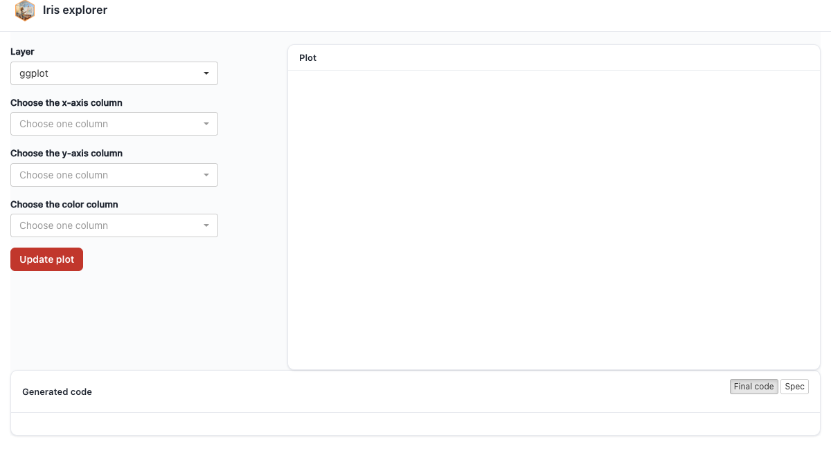
Swap the page builder with page = for a different Bootstrap-3 root — ptr_ui_page(..., page = shiny::fillPage) for edge-to-edge, for instance. The contract is any BS3 page builder whose ... are tag children: fluidPage (default), fixedPage, fillPage, bootstrapPage, basicPage. It is not navbarPage (which takes a positional title plus tabPanel() children) and not a bslib/BS5 page (the bundled CSS is Bootstrap-3-scoped). For those roots, decompose by hand (below).
All three panes — plot, error, code — are empty until the first Update plot click, exactly as in the bundled app. And ptr_ui_code() already renders its own bordered card with a “Generated code” header — drop it straight into the layout; don’t bury it in a collapsed tags$details(), or only the disclosure summary shows.
12.3 The familiar slide-out code window
Want the </> slide-out and inline error while owning the surrounding layout? Compose with the two combinators — this nested call is byte-for-byte the output block ptr_ui() renders internally. ptr_app() wires the same behaviour but builds its slide-out window slightly differently (its code-mode toggle sits in the window head), so only cosmetics differ from that path:
formula <- "ggplot(iris, aes(x = ppVar, y = ppVar, color = ppVar)) + geom_point()"

ui <- ptr_ui_page(
  ptr_ui_header("Iris explorer"),
  shiny::sidebarLayout(
    shiny::sidebarPanel(ptr_ui_controls(formula = formula)),
    shiny::mainPanel(
      ptr_ui_toggle_code(                                   # </> slide-out toggle ...
        ptr_ui_inline_error(ptr_ui_plot(), ptr_ui_error()), # ... around plot + inline error
        ptr_ui_code()                                       # ... wrapped as the slide-out window
      )
    )
  )
)
server <- function(input, output, session) {
  ptr_server(formula)
}

shiny::shinyApp(ui, server)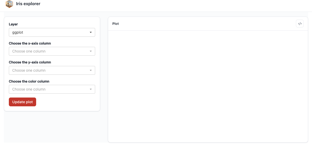
sidebarLayout: plot card with inline error slot, code window behind the </> toggle.12.4 Custom or navbarPage roots — decompose by hand
For the roots ptr_ui_page() deliberately does not cover, hand-build what it expands to — a Bootstrap page, ptr_ui_assets() once (its only sanctioned use), and one div(class = "ptr-app") around the pieces:
formula <- "ggplot(iris, aes(x = ppVar, y = ppVar, color = ppVar)) + geom_point()"

ui <- shiny::navbarPage(
  "Iris explorer",                            # navbarPage needs a positional title
  shiny::tabPanel(
    "Plot",
    ptr_ui_assets(),                          # the bundle, once (self-deduping) — escape hatch
    shiny::tags$div(
      class = "ptr-app",                      # the single theme scope
      shiny::sidebarLayout(
        shiny::sidebarPanel(ptr_ui_controls(formula = formula)),
        shiny::mainPanel(
          ptr_ui_toggle_code(
            ptr_ui_inline_error(ptr_ui_plot(), ptr_ui_error()),
            ptr_ui_code()
          )
        )
      )
    )
  ),
  shiny::tabPanel("About", "Built with ggpaintr.")
)
server <- function(input, output, session) {
  ptr_server(formula)
}

shiny::shinyApp(ui, server)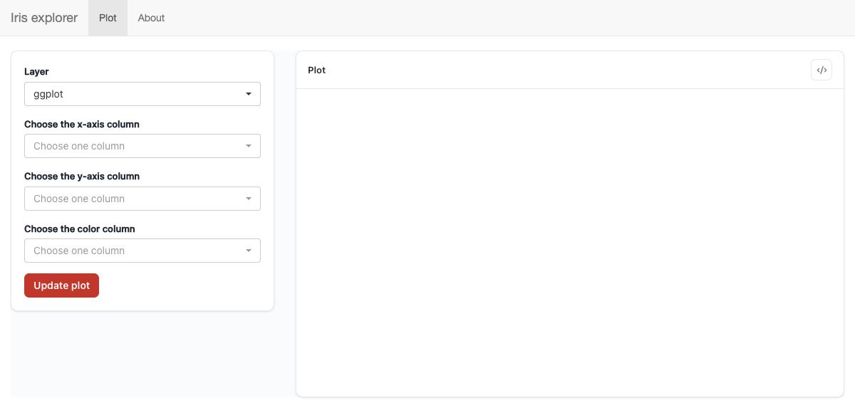
navbarPage, with the assets and theme scope reproduced by hand.This is exactly the body of ptr_ui_page() — page(ptr_ui_assets(css), div(class = "ptr-app", ...)) — inlined into the one tab, so it doubles as a transparent view of what the shell does for you. Keep ptr_ui_assets() and the .ptr-app wrapper inside each tab that hosts ggpaintr pieces; the bundle is self-deduping, so repeating it costs nothing.
12.5 Placing individual placeholder widgets
ptr_ui_controls() is the whole controls panel and is the supported way to render the generated widgets. ggpaintr does not expose a public accessor for the parsed node tree, so hand-placing individual placeholder widgets is not a supported workflow. To add custom widget types, register them instead — Chapter 6.
12.6 Swapping a pane for your own renderer
Never place ptr_ui_plot() and put a plotly::plotlyOutput() there instead — that is the custom-renderer pattern, and it gets its own chapter: Chapter 13.